![http://problemata.huma-num.fr/omeka_beta/files/large/2014/pense-pour-quot-laisser-une-impression-de-non-fini-quot-[photo-archives-rl]-1633680126.jpg http://problemata.huma-num.fr/omeka_beta/files/large/2014/pense-pour-quot-laisser-une-impression-de-non-fini-quot-[photo-archives-rl]-1633680126.jpg](http://problemata.huma-num.fr/omeka_beta/files/large/2014/pense-pour-quot-laisser-une-impression-de-non-fini-quot-[photo-archives-rl]-1633680126.jpg)
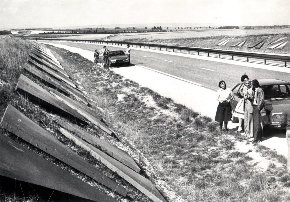
Since 1976, the Autoroutes Paris-Est Lorraine (Apel), the Sanef at the time, studied how to break the monotony of the crossing. Apel then launched this visual experience to introduce a new concept in the development of motorway axes: color to humanize and break up the perception of the terrain to awaken the motorway, with the insertion of a new scale of sensory and emotional perception. in the utilitarian world. With the painter Guy De Rougemont, the Parisian architectural firm Sopha is developing this project of colorful geometric figures. The structures range from the sphere to the totem cylinder, passing through the concrete plate or the cube, with color gradients to leave an impression of unfinished. The colors used are perceptible at very variable distances to avoid surprising the motorist. At a speed of 100km/h, red is visible at 5 km, green at 4 km, white at 3 km, yellow at 1.6 km, blue and purple at 0.8 km. A little over forty years later, the geometric figures are still printed on the ribbon of bitumen between Sainte-Menehould and Châlons-en-Champagne.